improved
Features
UX/UI
Scrollable Text, Trend Lines, and Chart Improvements
Here are a couple of less noticeable but oh-so-nice updates to the widgets you use all the time.
Take a look at this video walkthrough that explains the updates.
Scrollable text widgets

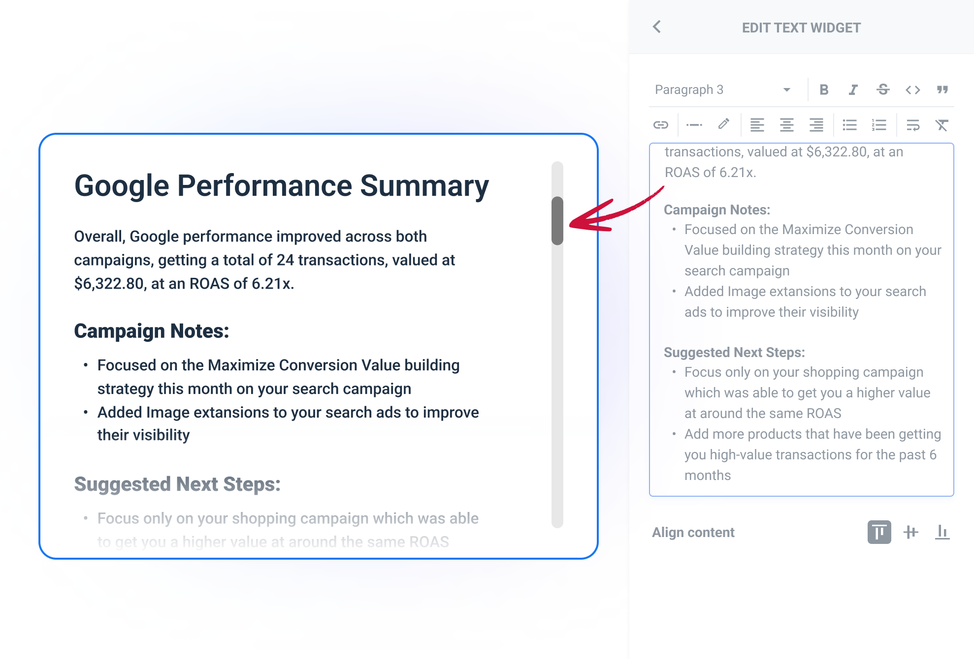
No matter how extensive and detailed your text summary is, it will now occupy as little space as you wish!
This update is pretty straightforward: if you type more text than a widget can fit in its current size, a scroll bar will appear on the side.
Trend lines

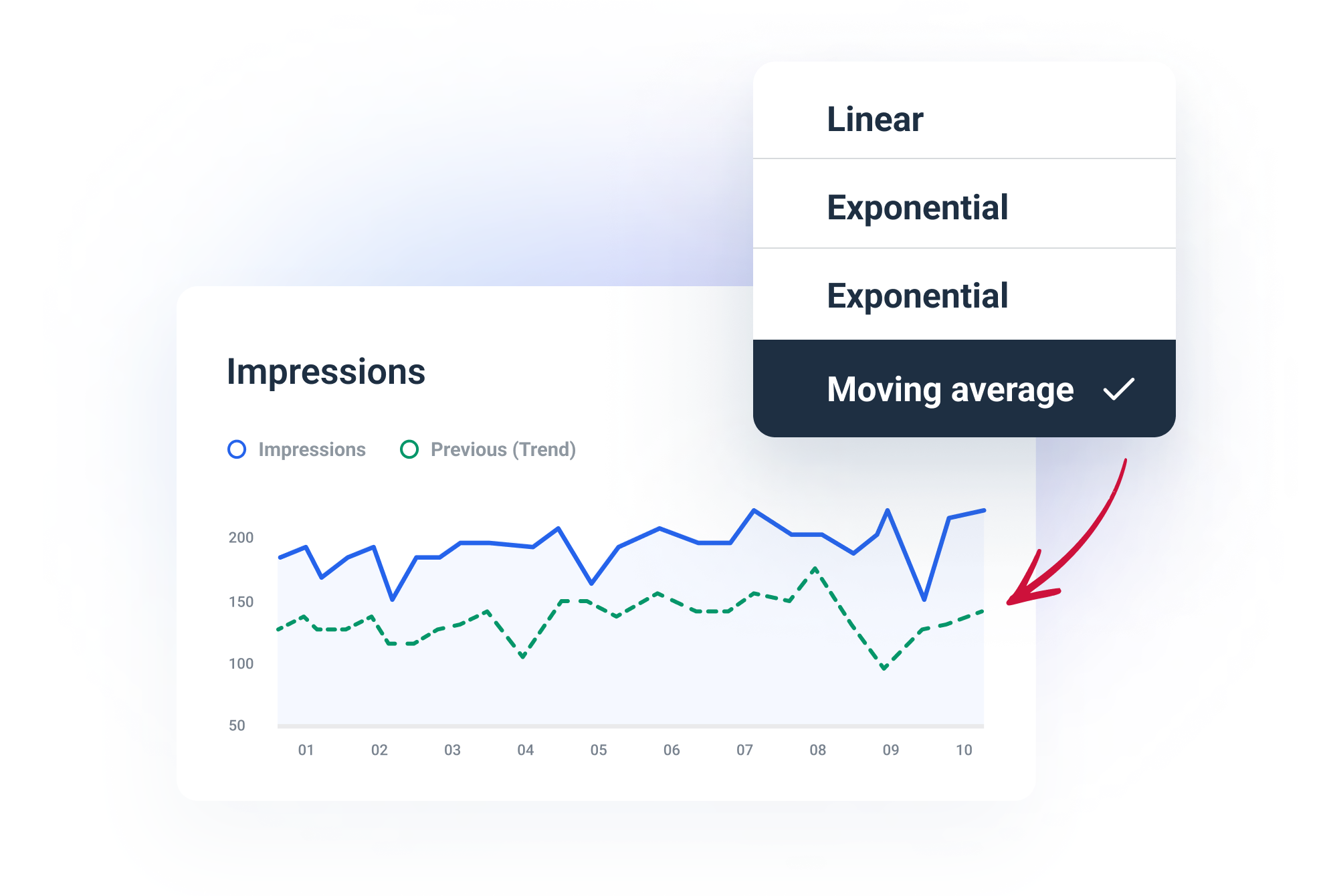
You can now highlight a trend in the area, line, and bar widgets. To do that, add a line showing the general progression for a certain metric over time.
The trend line is off by default, but this new option can be found in a
metric's settings
. It's the most granular level of settings out there. There are also multiple trend line types to choose from.
Pie charts and donut charts update

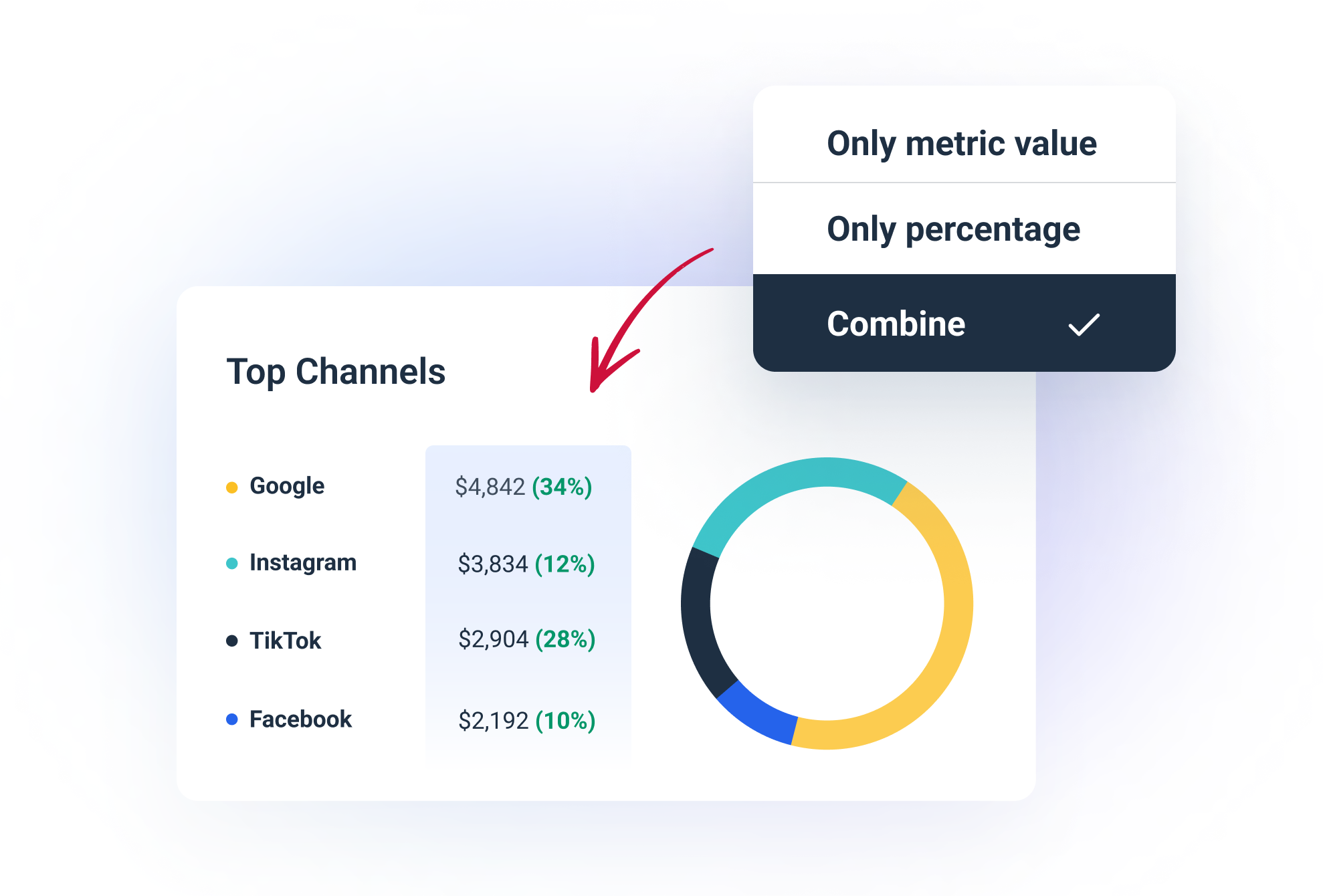
By default, you see both numeric values and percentages when creating pie and donut charts.
Now, if you want to stick only to one (numbers or %), you can select a suitable option in the widget settings.