improved
UX/UI
3 New Updates: Summary Rows and Data Labels

We've launched a couple of improvements that
help you present insights more clearly in the Overview, Multi-Source Tables, and Goal Widgets.
Learn more below:
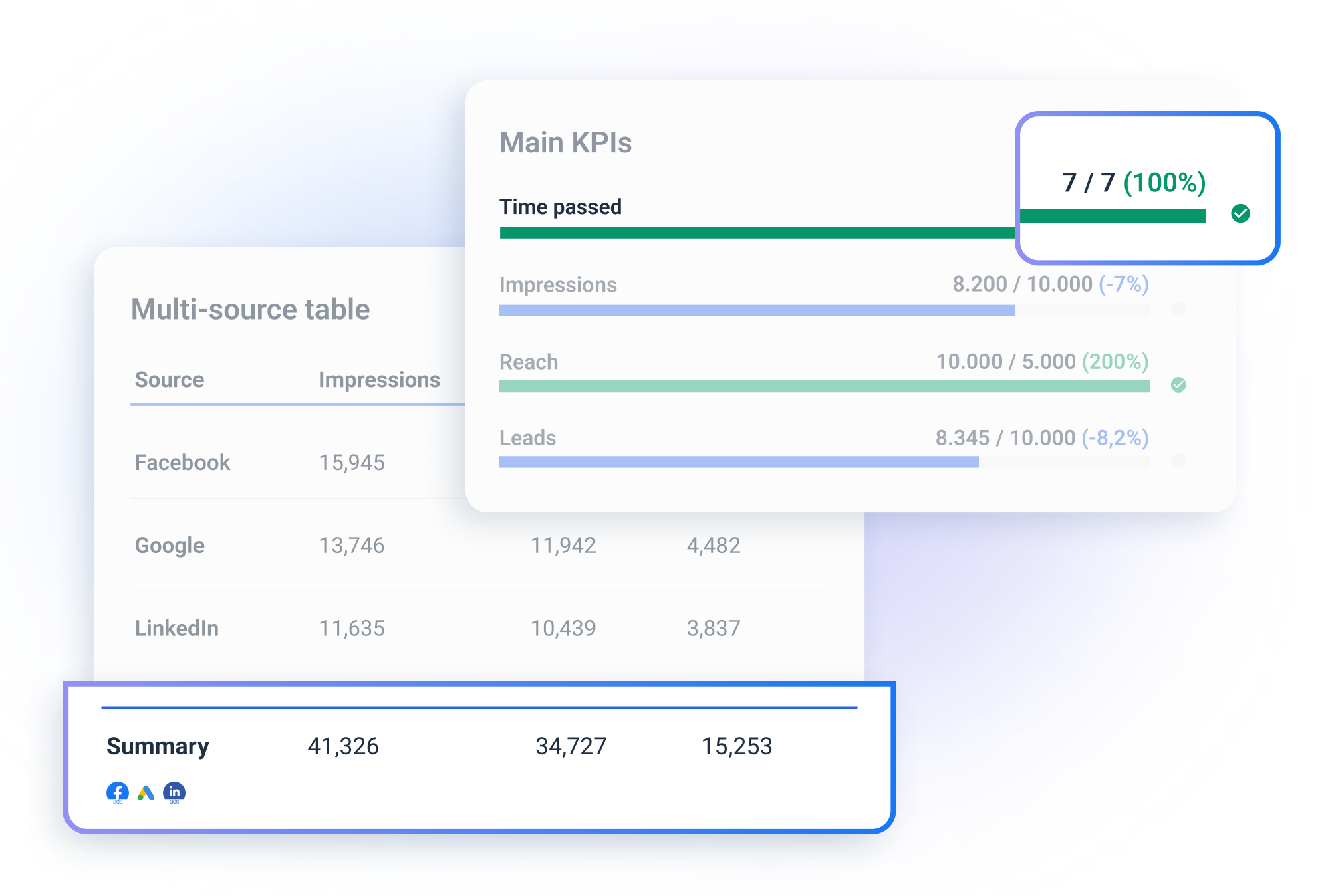
1. Summary Rows in the Overview and Multi-Source Tables
We've now added summary rows to both; they work the same way as summary rows in regular tables.
- You can now turn the summary row on and off in the widget settings for Multi-Source Tables.
- For your Overviews, it's on by default.
Please note that there are cases when these rows will display "-" for specific columns.
For example, when the metrics in the column are averages (e.g., CTR %) or unique ones (e.g., "Reach from Facebook"). This is done to avoid any misinterpretation of data with metrics that don't make much sense summarized.
2. Data Labels in the Goal Widget
The
"Display labels on charts"
option is now available for your goal widgets. When turned on, the
"percentage vs. the total goal"
label appears to show your progress. At the same time, you will see the "ideal pacing per day"
data label. Making the general progress (under or over pacing, and reaching or falling behind the target) visually clear in numeric value apart from just the progress bar.
- - -
These updates should give you more options to clarify your reports and dashboards and help you gather insights faster.
For any questions or feedback, reach out to our Live chat support.